Wednesday, 11 September 2013

Tuesday, 27 August 2013
Making Progress - Expanded Photographics

This was shot over a one hour period last night. I had intended to go for longer but me being the silly person I am forgot to use a fully charged battery. However - it's really interesting to note what's in this image. Having been shot over an hour there was quite a lot of movement on the ocean as well from planes and cars, not to mention the star movement itself. So I'm hoping that by extending the time period of the shoot to lets say 3-4 hours we will get a greater star trail as well as more additional light movement from boats and planes etc.
Friday, 23 August 2013
Star Trails (First Attempt)

Expanded Photographics!
Last night was clear enough for me to attempt to do this so I had a go....
It mostly worked out
Enough said really.
Wednesday, 21 August 2013
Wednesday, 14 August 2013
Expanded Photographics Project 02
The Proposal
I'm a bit conflicted on this project so bare with me.
I'm keen on looking at weather patterns over a period of a week.
(revised) I will present a time-lapse of a typical day in Houghton Bay. Starting early in the morning and continuing into the evening. My aim is to show what happens during a day as well as during the evening. I will also stack my evening images together to create a star trail image as well as combining images throughout the timelapse into one composite image. Followed up by merging the two images together to show star trails during different periods of the day
(mine)


Otherwise I thought going from what my original project was I could look at old wellington and new wellington. Showing change etc.
Example below
Town Hall from roughly the same perspective. (http://www.venueweb.co.nz/wcc_townhall/townhall_venues.htm)


Further detail.
Weather Patterns:
For this proposal I wish to explore how the weather changes over a period of a week. I can do this either by taking several photos throughout a day and create a time lapse or take one photo each day at the same time.
My goal would be to ultimately create either a time-lapse of the weather changing or to create a photo that merges all the elements of a weeks worth of ever changing weather.
Location: Houghton Bay
Camera/Equipment: d5100, tripod, shutter-release (if I can get one on the weekend), Either using my 18-55mm or 50mm lens. Most likely with the 18mm as I can get more into the frame.
Time: Either from sunrise to sunset or in the afternoon depending on which one I do.
Historical Wellington:
For this proposal I wish to explore the change Wellington has gone through over a period of time. 50 years ago streets, buildings, etc were different to how they are today. It would be interesting to compare today's world to the past through photography.
My goal would be to create an image or series of images that have elements of both. Although I am unsure on the details of how to get the older images.
I'm a bit conflicted on this project so bare with me.
I'm keen on looking at weather patterns over a period of a week.
(revised) I will present a time-lapse of a typical day in Houghton Bay. Starting early in the morning and continuing into the evening. My aim is to show what happens during a day as well as during the evening. I will also stack my evening images together to create a star trail image as well as combining images throughout the timelapse into one composite image. Followed up by merging the two images together to show star trails during different periods of the day
(mine)
Otherwise I thought going from what my original project was I could look at old wellington and new wellington. Showing change etc.
Example below
Town Hall from roughly the same perspective. (http://www.venueweb.co.nz/wcc_townhall/townhall_venues.htm)


Further detail.
Weather Patterns:
For this proposal I wish to explore how the weather changes over a period of a week. I can do this either by taking several photos throughout a day and create a time lapse or take one photo each day at the same time.
My goal would be to ultimately create either a time-lapse of the weather changing or to create a photo that merges all the elements of a weeks worth of ever changing weather.
Location: Houghton Bay
Camera/Equipment: d5100, tripod, shutter-release (if I can get one on the weekend), Either using my 18-55mm or 50mm lens. Most likely with the 18mm as I can get more into the frame.
Time: Either from sunrise to sunset or in the afternoon depending on which one I do.
Historical Wellington:
For this proposal I wish to explore the change Wellington has gone through over a period of time. 50 years ago streets, buildings, etc were different to how they are today. It would be interesting to compare today's world to the past through photography.
My goal would be to create an image or series of images that have elements of both. Although I am unsure on the details of how to get the older images.
Monday, 5 August 2013
Expanded Photographics - Revisiting Research - Final Post
And finally it's time that I take you through some of the research that I looked into.
First up I want to break this down really into something nice and simple. What I looked at during my research was a combination of Films, Television Mini-Series, Games, and even a War Photographer.
Now without going into detail about each and every thing I'm going to give you the cliff notes on what I looked at. Specifically the style of portrayal.
 Band of Brothers is an 11-Hour long Mini-Series set during World War II.
When I approached this piece of media I looked at two things in particular. Firstly, how the colours looked and secondly what sort of shots they used to portray intense action sequences. This was necessary for me to gauge what sort of shots I should be taking in my photo-set.
Findings:
I found that the colours they used in this series were very pale and dull. This was probably due to the fact that it is set during an older time period, while this remains true there was noticeable 'darkened' colours whenever Easy Company were in battle.
Most of the shots were fairly linear although when in battle the camera would shake quite a lot and as I was trying to produce a still I found that to bit less useful. However what I took from that was scenes that have a slight disposition tend to increase the drama.
The Pacific
 The Pacific also echoed a lot of the same elements that were initially set up in Band of Brothers. So the colour pallet remained largely the same although there were more noticeable darker shots and one thing that I found that stood out in particular was the use of "simple colours" in the title card. Lots of black, pale background, red smudge.
Findings:
As stated the colours were largely the same aside from an increase in darker tones. This gave way to the idea that when depicting possible threats the use of black really makes the scene more intense and when using a vivid colour such as red it tends to suggest that death is imminent.
One thing I forgot to mention in the above info section of "BOB" was the use of perspective shots. This is really captivating as it gives you the scope of destruction that has occurred.
Battlefield 3
 Battlefield 3 is is a multi-platform video game that places gamers into a photorealistic war that is at best quite thrilling.
This game uses a wide variety of colour tones to depict certain scenes. While the use of blacks is common most of the daylight parts of the game have the same pale effect as the previous two Mini-Series above.
Findings:
Colours were of a wide variety. Lots of blacks and vivid colours such as red, blue, yellow.
Most of the gameplay has what I would call a 'motion camera' where when the player walks or runs the camera shakes and gives off that thrilling suspense that we've all come to know and love.
Robert Capa
 Robert Capa was a Hungarian war photographer/photojournalist who covered five different wars, World War II, Spanish Civil War, Second Sino-Japanese War, the 1948 Arab-Israeli War, and the First Indochina War. He is also the co-founder of Magnum Photos which is the first cooperative agency for worldwide freelance photographers.
Findings:
Unlike the above info sections with Robert Capa's work he shot in B/W. Not only does this scream 'Historical' but it really does give you that war vibe.
Some shots that I found were slightly blurred but others had that distinctive 'Heroic' shot
Case in point.

So judging from the research I summised that my shots needed to have a form of individuality to them. While I'm trying to create a narrative across frames it was important that each shot had the appropriate colour tone and camera angle/effect. I had already gathered that I would be using a lot of blacks but the use of another dominant colour was intriguing. That and the use of B/W. Yes I certainly had to have it all. Why? Because it was important that I have a distinct look to this work.
First up I want to break this down really into something nice and simple. What I looked at during my research was a combination of Films, Television Mini-Series, Games, and even a War Photographer.
Now without going into detail about each and every thing I'm going to give you the cliff notes on what I looked at. Specifically the style of portrayal.
Band of Brothers
 Band of Brothers is an 11-Hour long Mini-Series set during World War II.
When I approached this piece of media I looked at two things in particular. Firstly, how the colours looked and secondly what sort of shots they used to portray intense action sequences. This was necessary for me to gauge what sort of shots I should be taking in my photo-set.
Findings:
I found that the colours they used in this series were very pale and dull. This was probably due to the fact that it is set during an older time period, while this remains true there was noticeable 'darkened' colours whenever Easy Company were in battle.
Most of the shots were fairly linear although when in battle the camera would shake quite a lot and as I was trying to produce a still I found that to bit less useful. However what I took from that was scenes that have a slight disposition tend to increase the drama.
The Pacific
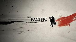
Findings:
As stated the colours were largely the same aside from an increase in darker tones. This gave way to the idea that when depicting possible threats the use of black really makes the scene more intense and when using a vivid colour such as red it tends to suggest that death is imminent.
One thing I forgot to mention in the above info section of "BOB" was the use of perspective shots. This is really captivating as it gives you the scope of destruction that has occurred.
Battlefield 3

This game uses a wide variety of colour tones to depict certain scenes. While the use of blacks is common most of the daylight parts of the game have the same pale effect as the previous two Mini-Series above.
Findings:
Colours were of a wide variety. Lots of blacks and vivid colours such as red, blue, yellow.
Most of the gameplay has what I would call a 'motion camera' where when the player walks or runs the camera shakes and gives off that thrilling suspense that we've all come to know and love.
Robert Capa

Findings:
Unlike the above info sections with Robert Capa's work he shot in B/W. Not only does this scream 'Historical' but it really does give you that war vibe.
Some shots that I found were slightly blurred but others had that distinctive 'Heroic' shot
Case in point.
So judging from the research I summised that my shots needed to have a form of individuality to them. While I'm trying to create a narrative across frames it was important that each shot had the appropriate colour tone and camera angle/effect. I had already gathered that I would be using a lot of blacks but the use of another dominant colour was intriguing. That and the use of B/W. Yes I certainly had to have it all. Why? Because it was important that I have a distinct look to this work.
Expanded Photographics - Building the Object.
When it came to outputting this project into a physical object I had planned initially on producing a canvas print of my photos. However when it came time to execute this it ultimately flopped it would have taken too long for the printers to produce. So I opted to instead get a laser printed copy of my canvas print to mount on some black card. I'd like to say this was a success but that would be lying. Because the image that was printed was too small and you couldn't see any of the necessary detail in the image. Bit of a drag.
So my last and final option was to make a pseudo booklet type of object. By printing the images individually and mounting on the black card I could bind them together to create a rough looking old-school photographic book. This turned out quite well.
So the following are some images showing my process on making said book, and some comparison shots between that and my original idea.


So my last and final option was to make a pseudo booklet type of object. By printing the images individually and mounting on the black card I could bind them together to create a rough looking old-school photographic book. This turned out quite well.
So the following are some images showing my process on making said book, and some comparison shots between that and my original idea.


Subscribe to:
Posts (Atom)